Your name is ready. Which typeface will you write it in? A guide to choosing the logo font and tagline for your business
Put two jars of honey on the same shelf. Same honey, same name, same price. The only difference is that the first is written in a warm, hand-drawn script and the second in a thin, technical typeface that looks like an app font. Which one would you believe comes from a local apiary?
Most people pick the first without thinking. And that is what this guide is about: the typeface tells a story about your business before the customer reads a single word. So once you have chosen your business name, a question that seems simple comes next: which typeface will you write it in?
Many founders answer it quickly. They open a design app, try a few fonts and pick whatever looks nice. Then they add a descriptive line under the name in another font, chosen the same way. The result is a logo that doesn’t express the business, or one that loses its clarity when it shrinks on a phone screen.
This guide focuses on two elements only: the logo font and the tagline font. We start from your brand brief, choose the type category, add the tagline, and finish with simple tests before you commit. And we apply every step to one example, from start to finish.
Why the logo font deserves this attention
The logo is the one thing that appears almost everywhere: the sign, the packaging, the invoice and your Instagram profile picture. And customers see the shape of the letters before they read them, so they form a first impression in seconds. Is this business luxurious or simple? Traditional or modern? Formal or friendly?
The real problem is not choosing an ugly font, but choosing a font that says the opposite of what the name says. A women’s salon called “Lamsa”, meaning “a touch”, promises softness and care, yet its logo is set in a heavy, sharp-cornered font that looks like a car-workshop sign. The customer feels that something doesn’t fit, even without knowing why.
Why it’s harder than any other use of type: a logo must stay clear at a metre wide on a sign and at one centimetre on a phone. A font that looks beautiful at a large size can become an unreadable smudge at a small one.
Start from your brand brief, not from a list of fonts
If you wrote a brand brief when you chose the name, you already have half the answer. Go back to two elements in it: the personality of the business, and the feeling you want the customer to have.
Turn adjectives into shapes
Take the three adjectives you used to describe your business, and ask of each one: what would it look like if we drew it as letters?
| The adjective in the brief | What it means in type |
|---|---|
| Warm, friendly | Rounded ends, joined or soft letters |
| Honest, simple | No ornament, medium weight |
| Bold, strong | Heavy weight, wide letters |
| Luxurious, calm | Contrast between thin and thick strokes, generous spacing between letters |
| Technical, precise | Geometric shapes, clear angles |
| Heritage, authentic | A traditional Arabic calligraphic style, or one inspired by it |
Mind your sector
Every sector comes with visual expectations from its customers:
Cultural and religious institutions
Heritage scripts with gravitas, such as Thuluth and Diwani.
Technology
Clean geometric typefaces with few curves.
Restaurants and food
Flexible, soft typefaces that suggest movement and appetite.
Medical
It depends on the specialty. A cosmetic clinic suits soft, elegant typefaces, while an orthopaedic clinic suits sturdy geometric ones with a touch of softness.
The sector gives you a starting point; the brief sets the final direction. Sometimes a deliberate break from your sector’s expectations is exactly what sets you apart. Collect the logos of five competitors, and if they all share the same style, that is your opportunity.
Choose the right type category for your logo
Once you know the qualities you are looking for, choose the category that carries them. These are the best-known categories and what they usually suggest.
Arabic typefaces
Kufi Clear angles and a geometric structure. It suggests authenticity and strength, and holds up well when reduced.
Naskh And the modern typefaces built on it: clear and familiar. It suggests trust and closeness.
Thuluth and Diwani Flowing and ornate. They suggest luxury, but lose their clarity quickly at small sizes.
Latin typefaces
Serif Small strokes at the ends of the letters. It suggests stability and experience.
Sans serif Simple and clean. It suggests modernity and clarity.
Script It imitates handwriting, and suggests warmth and a personal touch.
Display Wide and distinctive, designed for headlines and names only.
A ready-made font, or custom lettering?
You have two ways to write the name in your logo:
A ready-made font
You pick an existing font and set the name in it, with small adjustments to the spacing between the letters. It is faster and cheaper, but someone else may use the same font.
Custom lettering
A designer draws your name by hand, then turns it into a digital file. The result is a logo like no other, but it needs more time and a bigger budget.
Many startups begin with the first route, then move to the second as they grow.
A worked example: the Lamsa logo in three fonts
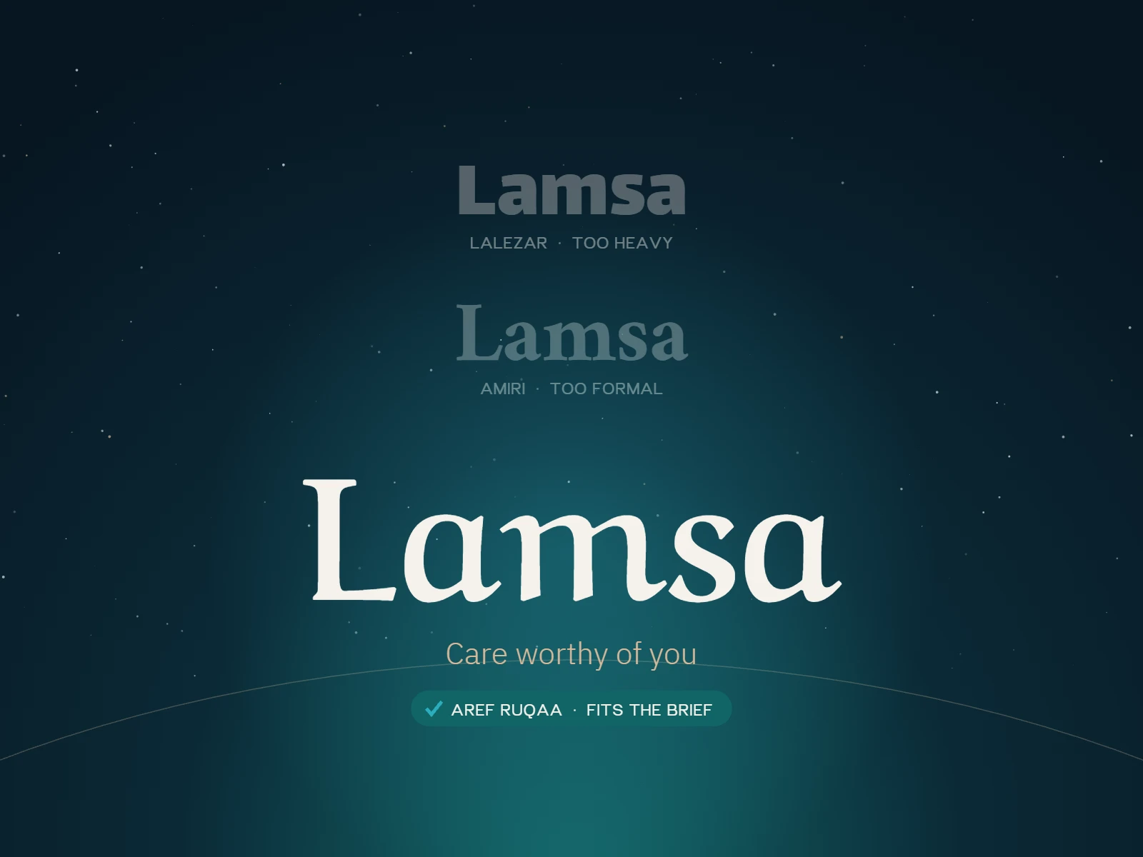
Back to the women’s salon from the start of this article. The name is “Lamsa”, and its personality in the brief is soft, elegant and comfortable. The name itself gives us a hint: a touch is something made by hand.
We tried the name in three free typefaces from Google Fonts:
LalezarWide display fontA loud, playful place, like a toy shop or a fast-food restaurant.
No: heavy, and doesn’t suggest softnessAmiriClassic NaskhA refined, formal institution, like a publishing house or a law firm.
Partly: elegant, but more formal than neededAref RuqaaRuqaaA name written by hand, with a calm, flowing movement.
Yes: soft and close, and fits the meaning of “a touch”The decision: Ruqaa is the closest to Lamsa’s personality. But it has a clear weakness: it loses its clarity at small sizes and in long text. That leads straight to the next step, choosing a second typeface for the tagline.
Choose the tagline font
The tagline is a short line that appears with the name and explains what you offer. Its role is supportive, so it must not compete with the name for attention. The name is read first, then the line.
Apply the rule of “one similarity, two differences”
The two typefaces should work together without looking alike. The practical rule:
- One similarity that connects them, such as a similar letter height, or rounded ends in both.
- Two differences that set them apart, such as weight (heavy against light) and style (handwritten against printed).
If the two typefaces are too similar, it looks like a mistake. If they are completely different, the logo looks like two separate pieces.
Get the size and spacing right
- Make the tagline clearly smaller: around a third to a quarter of the name’s height.
- Leave enough space between it and the name so the two don’t stick together.
- Don’t add italics, shadows or effects without a clear reason. Effects don’t fix a weak design.
- Keep the line short. Three to six words is usually enough, and a long line won’t be read at small sizes.
Applying it to Lamsa
The name is set in Ruqaa, and the tagline, “Care worthy of you”, in a simple modern typeface such as IBM Plex Sans Arabic in a light weight.
- The similarity: both have soft ends, with no sharp corners.
- The first difference: the name is handwritten, and the line is printed.
- The second difference: the name is large and clear, and the line is light and small.
This way the name keeps its softness, and the line stays readable at any size. The same second typeface also works for the rest of the identity’s text: the service and price list, appointment cards and Instagram posts.
Test the logo before you commit to it
A logo that looks beautiful on a computer screen can fail in real use. Before you print anything, run it through these tests:
The small-size test
Put the logo in a small circle the size of an Instagram profile picture. Can you read the name? The tagline will probably disappear here, which is normal, but the name must stay clear.
The one-colour test
Print the logo in black only. If it relies on colour to be readable, the typeface itself needs a rethink.
The real-use test
Place it on a photo of a sign, a package and a phone screen. Many problems only show up here.
The two-language test
If your logo will appear in Arabic and English, put the two versions side by side and make sure neither looks bigger or heavier than the other.
The audience test
Show the logo to five people from your potential customers for one second, then ask them: what kind of business do you think this is? If their answers come close to your brief, the typeface is doing its job.
Finally, check the font licence. Some fonts are free for personal use only, and using them in a commercial logo can expose you to legal problems. Most Google Fonts are released under a licence that allows commercial use, but always read the licence.
Frequently asked questions about choosing a logo font
Does my logo need a tagline?
Not necessarily. It helps when the name doesn’t explain what the business does, as with “Lamsa”, which doesn’t say on its own that it is a salon. If the name is clear by itself, you can do without one.
How many typefaces should a logo use?
One for the name, and a second for the tagline when needed. More than that distracts the eye.
Can the name and the tagline use the same typeface?
Yes, as long as you separate them by weight and size, such as a bold name and a light line from the same family. It is a safe option if you can’t find a suitable second typeface.
What is the difference between a typeface and a font?
The typeface is the design itself, such as Naskh. The font is the digital file that carries that design in a specific weight, such as Naskh Bold.
Does a traditional Arabic script suit a modern business?
Yes, if you choose a simplified digital version of it. Many modern typefaces are built on Naskh or Kufi, so they combine authenticity and clarity.
Can I change the logo font after launch?
Yes, and it is easier than changing the name, but it means reprinting signs and packaging and updating your accounts. It is better to give testing its time before launch.
Sources
- Typography Design for Brand Storytelling, a course by designer Ellen Lupton on Domestika.
- “What is typography? Discover the secrets of fonts and the art of choosing them”, a podcast episode with identity and type designer Mohammed Zayed, on YouTube.
The logo font is not a cosmetic decision
It is the way your name is read everywhere. Here is the method in five steps:
- Turn your business personality into visual qualities
- Choose the type category that carries them, with your sector in mind
- Try the name in three fonts from different categories
- Give the tagline a font that shares one thing and differs in two
- Test at small size, in one colour and with your audience
Start today: write your business name in three fonts, and show them to five people from your audience.
No name yet? Start with our guide to choosing your business name with AI. And if you would like help designing your logo, book a visual identity session with us.
Book a visual identity session →Found this guide useful? Share it with a friend who is about to launch a business.